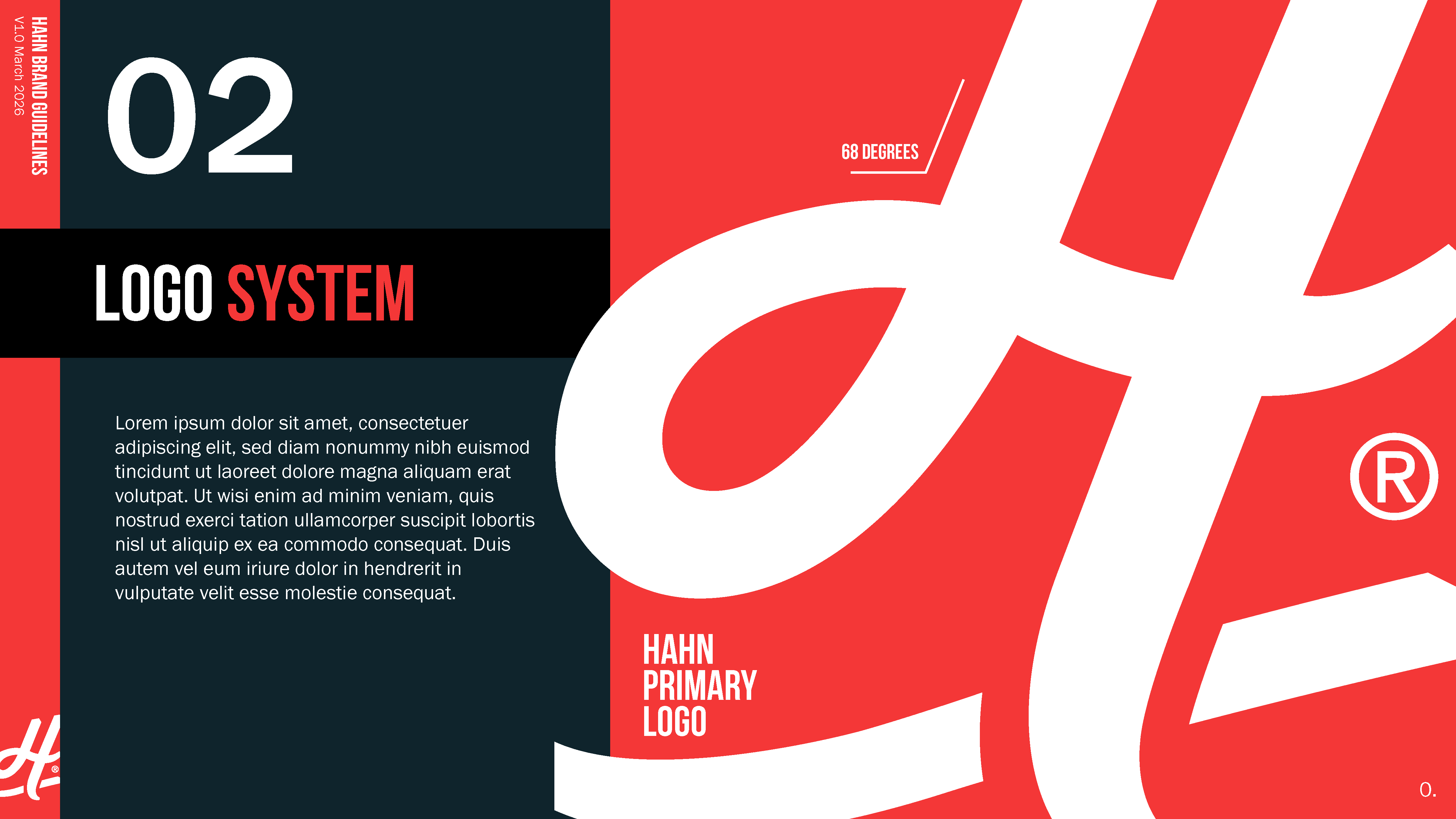
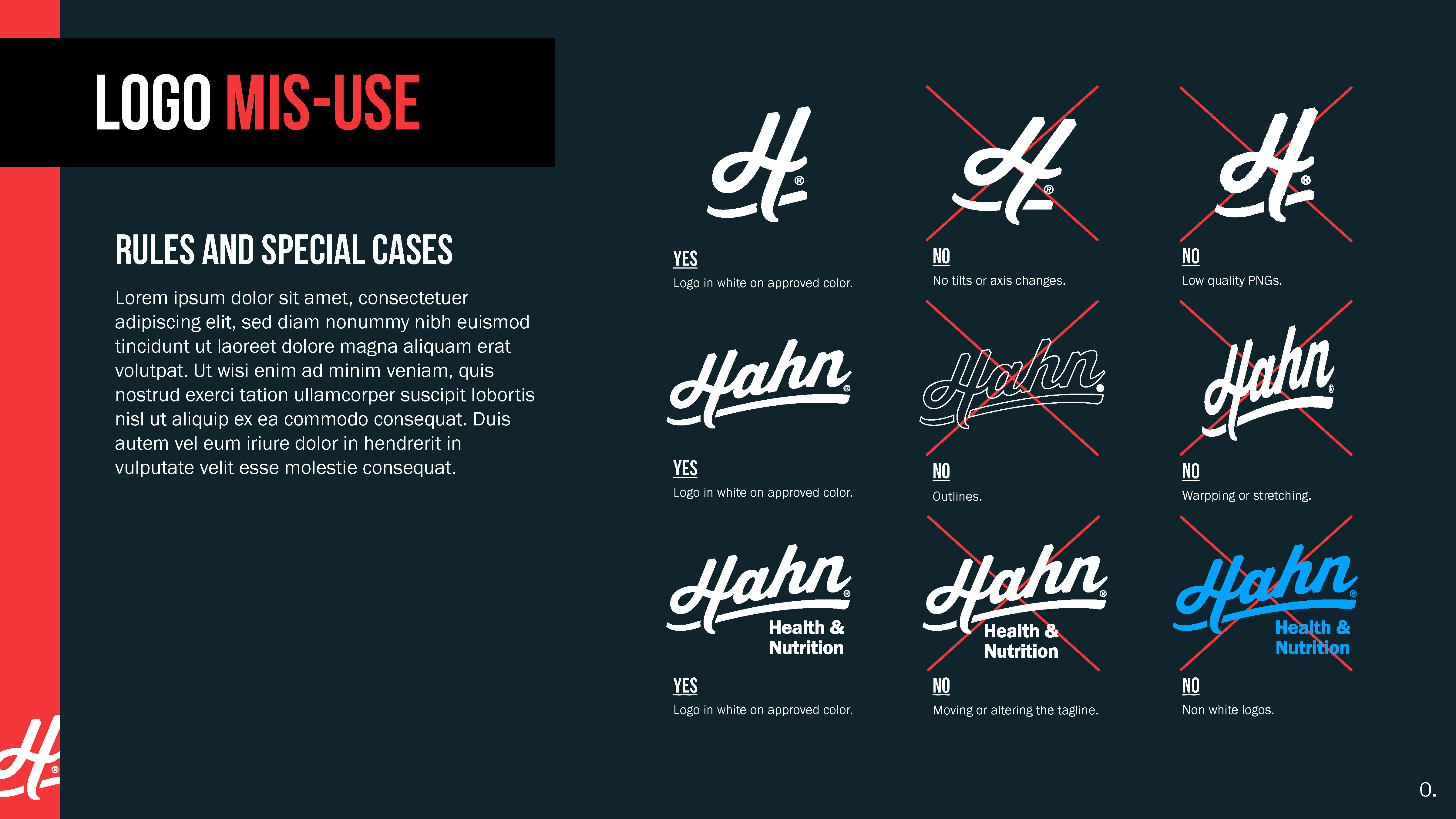
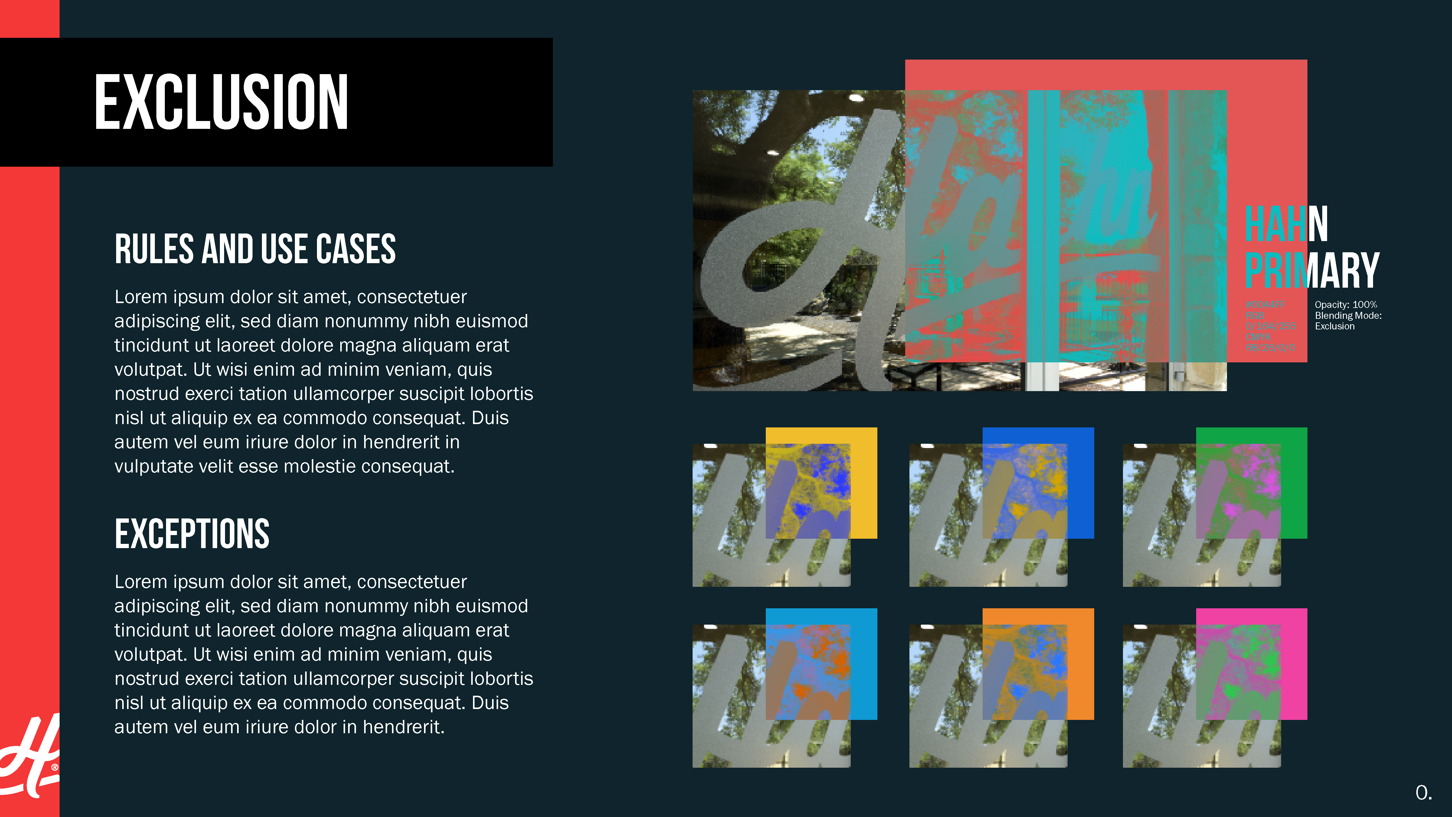
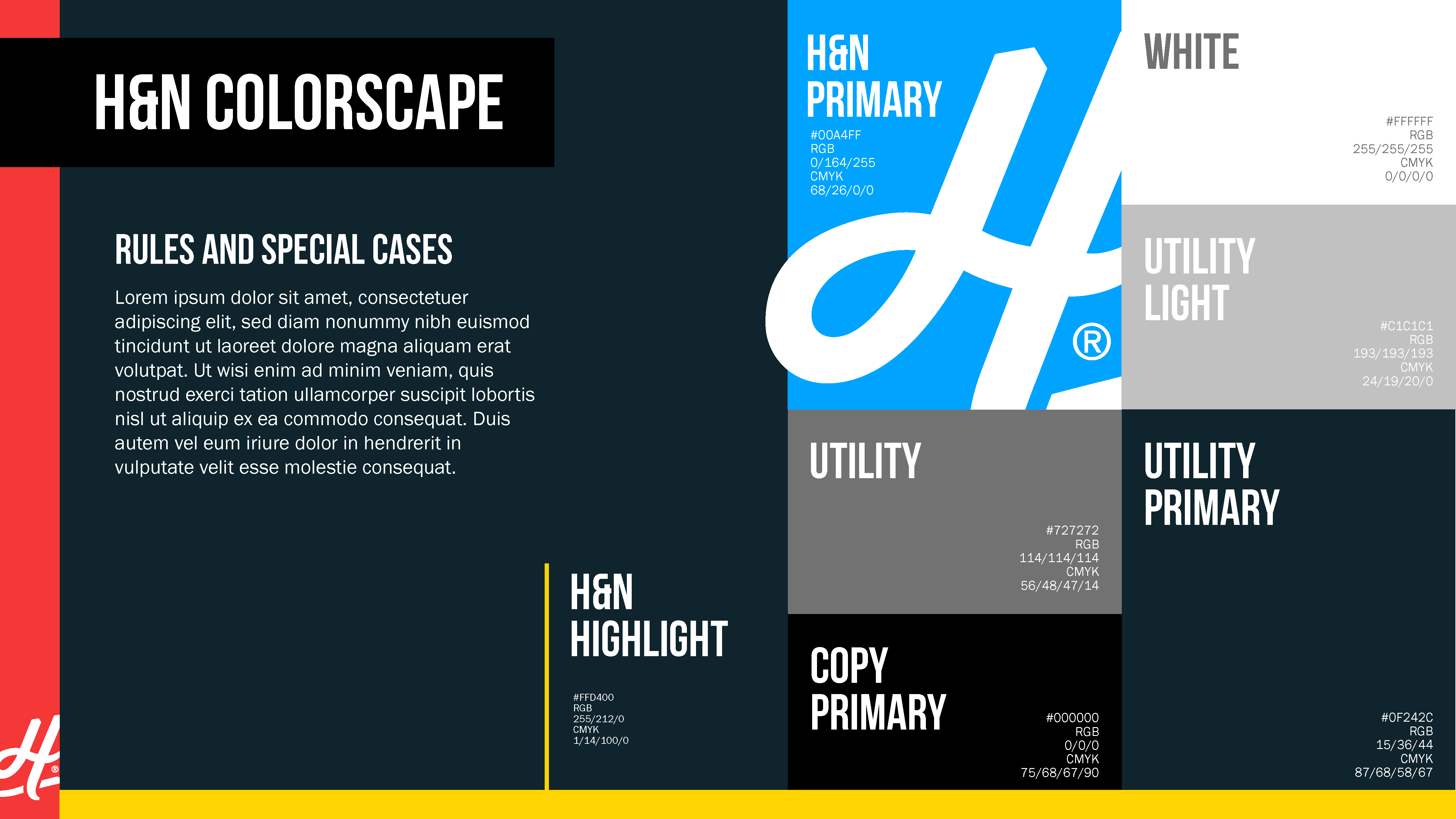
Agency Work

Hahn & GDC Marketing

Hahn

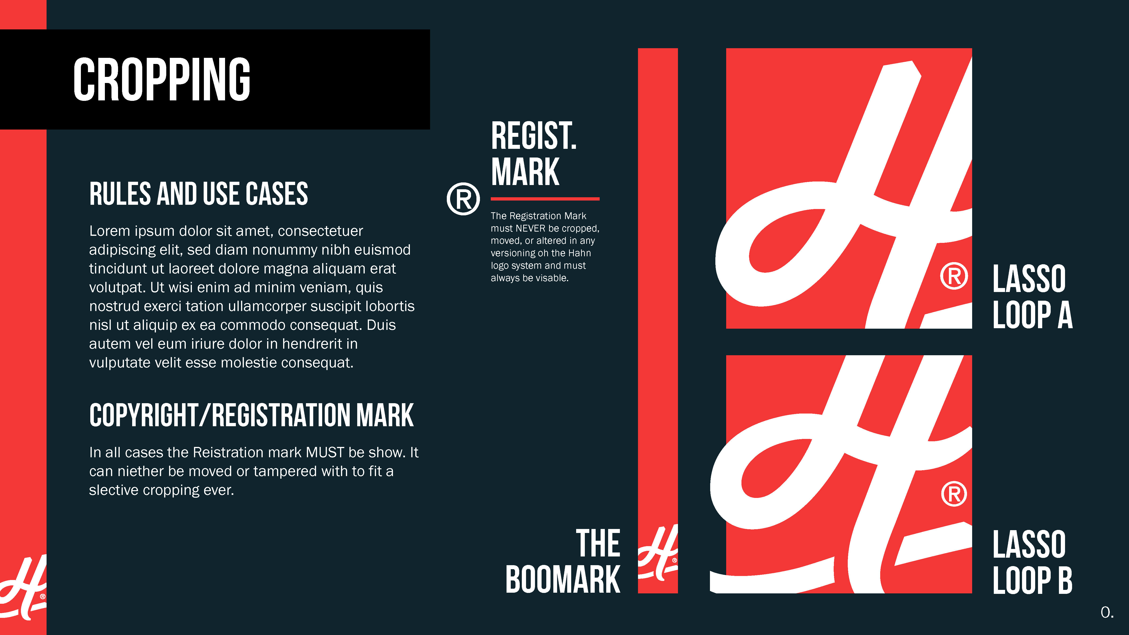
Hahn is an agency focused on delivering data-driven creative and crisis strategy for major food, energy, and health brands. They use a high-performance "3D engine" to create clean, high-impact visual storytelling.

Experience

My time in the agency flexed my versatility. I learned to move fast and handle every part of the process.

  • UNT
    UNT
  • UNT
    UNT
  • UNT
    UNT

Designing for UNT

Working at Hahn, I had the opportunity to design for many brands. One of which was a UNT ReBrand. For this UNT campaign, I focused on creating visuals that resonated with the heart of the student body. By blending the university’s iconic identity with modern, high-impact motion, I developed a suite of assets that felt less like "institutional marketing" and more like a community movement. My goal was simple: show the spirit of UNT rather than just talking about it.

  • EPE
    EPE
  • EPE
    EPE
  • EPE
    EPE

Logo Work for El Paso Eletric

Reimagining how a legacy utility brand connects with a modern audience. This project involved developing a visual system that balanced corporate reliability with a fresh, digital-first energy. By centering the design on the people of El Paso and Las Cruces, I created a suite of assets that felt both authoritative and approachable, proving that even the most essential services deserve world-class design.

  • NBU
    NBU
  • NBU
    NBU
  • NBU
    NBU

Isometric Infographic for NBU

My philosophy is that great design should come across instantly, especially when explaining complex infrastructure. For New Braunfels Utilities, I transformed the technical "service loop" into a high-impact visual narrative. By stripping away the jargon and focusing on a "show, don't tell" approach, I created an infographic that allows the viewer to grasp the entire water lifecycle in a single glance.

  • SINCLAIR
    SINCLAIR
  • SINCLAIR
    SINCLAIR
  • SINCLAIR
    SINCLAIR

Logo work for Sinclair

I developed this logo for Sinclair to bridge the gap between their IT and OT internal branches. By prioritizing instant clarity and a bold silhouette, I created a mark that works across every medium from massive signage to digital icons.